Why Better Photos Make Your Online Menu Move More Product
Your budtender just closed another sale. Walked a nervous first-timer through three different strains, showed them the packaging, let them smell the jars. Easy.
Meanwhile, your website’s showing that same customer blurry photos from 2022 and wondering why they bounced.
Here’s what nobody tells you about online cannabis sales: your photos aren’t decoration. They’re doing the job your best employee does face-to-face. And right now? Most of them are failing.
What photos actually do for anxious buyers
Watch someone shop your menu from their couch. No budtender to read their face. No jar to examine. No way to ask “will this make me paranoid?”
All they’ve got is a picture.
Good photos answer the unspoken questions. They show “this is real.” They prove “we care about details.” They whisper “you can trust what shows up.”
Bad photos? They scream “we couldn’t be bothered” or “is this place even legit?”
Your in-store customers get reassurance through conversation. Your online customers get it through pixels. The shops moving product online figured this out years ago.
Think about it this way: trust precedes every transaction. Without the ability to touch, smell, or examine products, photos become your only sensory proxy. They don’t just show what you sell—they signal whether you’re competent enough to deliver what’s shown.
The quiet ways photos kill your conversions
Three things happen when your menu photos suck:
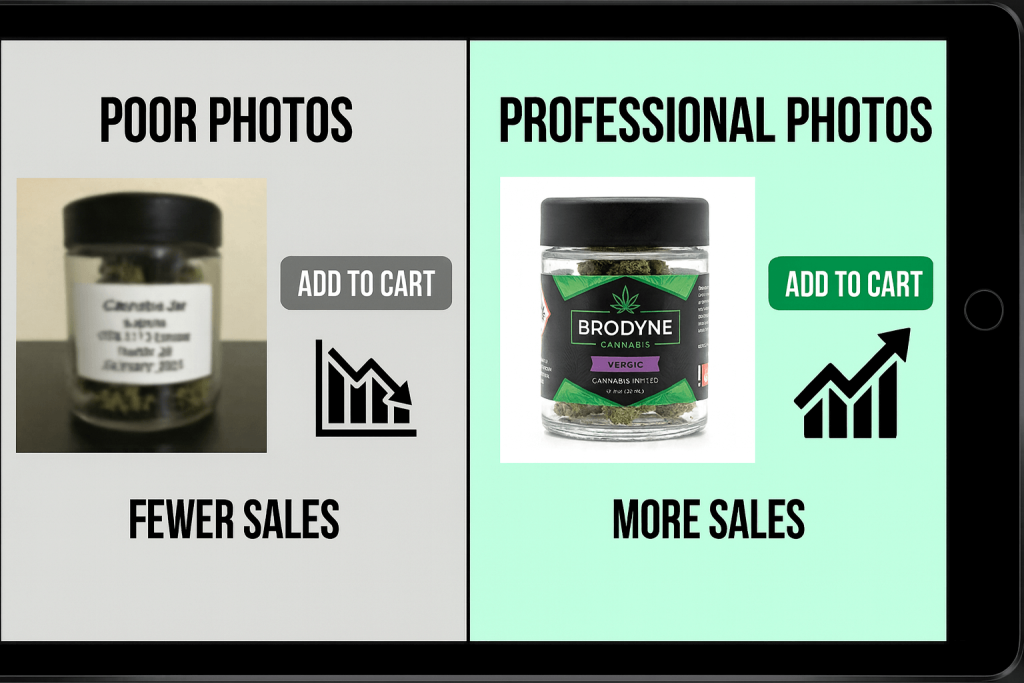
Dark or blurry shots make people think the product’s old or you’re hiding something. Doesn’t matter if that eighth is fire—if the photo looks like it was taken in a cave, nobody’s clicking buy.
Inconsistent angles make your whole shop feel disorganized. One product shot from above, next one from the side, another one still in someone’s hand? That’s visual chaos. Customers don’t stick around to figure it out.
Missing photos are worse than bad photos. Empty placeholder boxes next to product names make your menu look abandoned. Like showing up to a store with half the shelves empty.
Each problem compounds. Your customer’s already fighting anxiety about buying cannabis online. You just gave them three more reasons to close the tab.
Here’s the part most owners miss: every visual inconsistency adds micro-friction. Unlike a single big barrier—say, a broken checkout button—micro-friction accumulates invisibly. Customers don’t consciously think “these photos are inconsistent so I’m leaving.” They just feel uneasy and bounce.
Empty photo slots are especially deadly. Dispensaries think “I’ll add that later” without realizing an empty slot signals “we don’t care enough to finish.” A mediocre photo just says “we’re not professional photographers.” Big difference.
What confident buyers actually see
Pull up three competitors right now. Notice how the ones that feel premium all do the same thing?
Clean, bright photos. Same angle for every product. Consistent lighting. You can see the packaging clearly. The flower looks like flower, not like deep-fried jpeg artifacts.
They’re not hiring professional photographers. They’re just being consistent.
Here’s where most dispensaries overthink it. They assume “good photography” means expensive equipment and studio time. Wrong. Consistency matters way more than quality. A $50 lightbox and smartphone with uniform angles outperforms a $5,000 product shoot with inconsistent results every time.
Pattern recognition reduces risk in your customers’ minds. When every product follows the same photographic format, they can focus on comparing product attributes instead of wasting mental energy reconciling why some photos look professional and others look like someone’s Snapchat from 2019.
Here’s the move: pick one clean setup. Good natural light or a simple lightbox. Shoot every product the same way—same angle, same distance, same background. White works. Your counter works if it’s clean.
Then stick with it. Your menu starts looking like it belongs to an actual business instead of someone’s side hustle from 2019.
Customers notice. Not consciously—they just feel like they can trust what they’re seeing. That feeling closes sales.
Watch what happens when you nail this: photos create initial trust, trust enables menu browsing, browsing reveals selection, selection enables purchase consideration. Break that cascade at step one with bad photos? Nothing else matters.
The one detail that turns lookers into buyers
You’ve got good photos now. Add one sentence underneath that helps people decide.
Not marketing copy. Not “premium indoor flower” or other meaningless nonsense.
Something useful: “Piney flavor, good for evening.” Or “Mild, clear-headed focus.” Or “Sweet citrus, helps with sleep.”
Your budtenders say this stuff naturally. Your menu should too.
This tiny detail does something powerful—it connects the visual (looks trustworthy) to the practical (I know what this does). That’s when hesitation turns into checkout.
Some dispensaries now include customer-submitted photos alongside their professional shots. Real customers holding real products. It’s not pretty, but it works—creates social proof that reduces the “will this actually look like the picture?” anxiety.
The test that tells you everything
Open your menu on your phone right now. Scroll through like you’ve never seen these products before.
Ask yourself: “Would I buy this if I didn’t already know it was good?”
If the answer’s no—if the photos look sketchy, inconsistent, or just lazy—you found your problem.
Want to test it properly? Try this experiment: reorder your menu to show your best-photographed products first instead of alphabetical or by category. Track which products drive more cart adds. If your well-photographed items suddenly start moving faster, you’ve got hard proof that photos matter.
Or try this: remove your worst 10% of photos entirely. Just delete them. Track whether overall conversion improves. Sounds crazy, but some dispensaries with NO photos but strong descriptions actually outperform shops with terrible photos. Bad visuals can be worse than no visuals.
Here’s another test worth running: re-shoot just 20 products with identical format. Place them in a dedicated “new arrivals” section even if they’re not new. Compare the conversion rate of that section to your main menu. If the difference is significant, you’ve quantified the cost of your inconsistent photography.
Fix that before you spend another dollar on ads or SEO. Because driving more traffic to a menu that can’t convert is like hiring more budtenders for an empty store.
Why this matters more than you think
Remember how restaurants survived the shift to delivery apps? The ones that adapted fastest weren’t necessarily the best restaurants—they were the ones with the best photos on DoorDash and Uber Eats. Platform standardization forced visual consistency, and customers rewarded it with orders.
Or look at used cars. CarMax revolutionized the industry by enforcing 360° photo standards across all inventory. Customer trust increased enough that people started buying cars sight-unseen. Comprehensive visual documentation replaced physical inspection entirely.
Cannabis retail is in that same transition right now. Moving from “visual chaos” to “standardized visual language.” The dispensaries that figure this out first gain a trust advantage while everyone else is still debating whether photos matter.
Your photos are doing sales calls 24/7. Make sure they’re not bombing every pitch.
Leave a Reply