Why Your Website Gets Clicks But Not Customers (and How to Fix It)
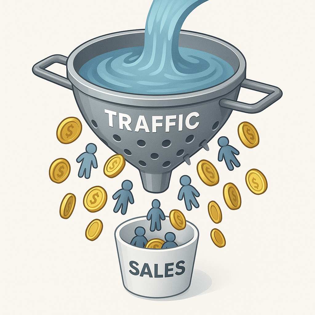
Your website tracker says 2,000 visits last month.
Your sales system says 140 online orders.
You’re probably thinking “7% isn’t amazing, but at least people are buying.”
Here’s the part that should bother you: for every person who ordered, thirteen others wanted to look but didn’t stick around long enough to even try. That’s not a traffic problem. That’s a “what the hell just happened to those other 1,860 people” problem.
Traffic isn’t your problem. Trust is.
Getting clicks is easy. Keeping attention is hard.
Most dispensary sites treat visitors like they’re already sold. They’re not. They’re one confusing menu away from hitting back and calling your competitor instead.
You wouldn’t let a customer stand at your counter for 30 seconds without saying hello, right? Your website does that every time someone waits for a page to load. Or scrolls past six screens of strain names with no help. Or tries to figure out if you’re even open today.
Clicks don’t mean customers. They mean chances. And most sites waste chances like they’re free.
Here’s what most owners miss: people don’t research your strains before deciding to buy from you. They decide to trust you first, then they browse. Trust comes before interest. But most sites lead with product details and hide the trust stuff at the bottom of the page.
Your hours, your real photos, your reviews—that’s what makes someone willing to look at your menu. The strain genetics and terpene profiles? Those matter after someone’s already decided you’re legitimate.
The three silent killers of online sales
Speed kills first. A page that takes more than three seconds to load loses half its visitors before anyone sees your menu. Mobile’s worse. Every extra second? You lose more people. Your beautiful product photos? They’re slowing you down. That Instagram feed you embedded? Costing you money.
And here’s the thing about slow pages: people remember the worst moment, not the average. One image that takes eight seconds to load poisons the whole visit. You could have ten fast pages, but that one slow product page? That’s what they’ll remember when they close the tab.
Clarity’s the second problem. Walk into your store and your budtenders help people. Online? You’ve got 40 products listed with no help at all. Sativa, Indica, Hybrid. Cool. But which one helps someone sleep? Which one won’t make them anxious? If your site makes people guess, they leave.
Then there’s flow. Or the lack of it. Most checkout steps feel like filling out a loan application. Age gate. Account creation. Pickup time. Payment method. By step four, half your customers are gone. Not because they changed their mind about buying weed. Because you made buying weed feel like homework.
How your site got this way (and why it’s not your fault)
Nobody woke up and decided to build a slow, confusing website. But here’s what happened:
Everyone you hired to help was paid to add things, not remove them.
Your web developer? They bill by the feature. More animations, more custom plugins, more hours. Your e-commerce platform? They sold you on their feature list—loyalty programs, email capture, Instagram integration. Your compliance consultant? They added extra verification steps to avoid any possible liability.
Each decision made sense at the time. But they stacked up. The Instagram feed seemed like good marketing. The detailed strain info felt educational. The account requirement seemed safer.
Now you’ve got a site that takes six seconds to load, asks for an email before showing prices, and makes people create a password just to see if you have their favorite cart in stock.
The only person losing from all that complexity? You.
How to spot what’s going wrong
Do this right now: pull out your phone and open your site like you’ve never seen it before.
Time how long it takes to fully load. If you’re counting past three seconds, you’re losing sales.
Now try to find your best-selling strain and add it to cart. How many taps did that take? If it’s more than three, you’re asking too much.
Finally, pretend you’re buying something. Notice where you stop and think.
Where you have to scroll back up. Where you’re not sure what to do next. Your customers feel that exact confusion. They just don’t stay to figure it out.
Your site might look fine on your laptop at the shop. But your customers are looking at it on a cracked iPhone screen while their kid’s asking for a snack. Design for that reality.
Most owners built their sites on a big screen, tested them on a big screen, and approved them on a big screen. But 70% of their customers are buying on phones. That’s the gap. What works on desktop falls apart on mobile.
Quick fixes that make visitors buy
Start with your homepage. One screen should answer one question: “Why should I buy here?” Not ten reasons. One. Maybe it’s same-day delivery. Maybe it’s your budtender team. Maybe it’s that you stock the one brand nobody else carries. Pick your lane.
Move your “Add to Cart” buttons up. Way up. People shouldn’t have to scroll past strain history and lab numbers just to buy something. Give them the button first, the details second.
Show trust stuff early. Store hours. Real photos of your actual shop. Recent reviews. That star rating you worked hard for. Don’t hide this in your footer. It’s the difference between “maybe” and “okay, let’s try them.”
And please, make checkout simpler. Remove every question that isn’t legally required. Let people check out without making an account. Pick your fastest pickup time as the default. Make buying from you easier than thinking about it.
The real math on why this matters
You don’t need fancy software to know if this stuff works. Watch three things:
How many visitors actually buy. Even moving from 2 out of 100 to 3 out of 100 means 50% more sales from the same traffic.
Average cart size. If people start adding a second item more often, your flow’s working.
Calls from your site. Not every fix shows up in orders. Sometimes better info just means more people call to ask questions before buying. That’s still a win.
And here’s why most owners waste their money: they think more traffic solves low sales. It doesn’t. If 98 out of 100 visitors leave without buying, getting 10 times more traffic just means 980 people leaving instead of 98. You’re spending more money to watch more people bounce.
Fix what happens after the click. Then scale the traffic.
Your budtenders already know this
Walk up to your best budtender right now and ask: “What do customers ask you every single day?”
Bet you’ll hear: “What’s good for sleep?” “Which one won’t make me paranoid?” “What’s the difference between these two?”
Your website doesn’t answer those questions. It just lists THC numbers and says “cannabis flower” forty times.
Your team knows how to sell in person because they listen and respond. Your site can’t listen. But it can answer the five questions everyone asks before they trust a new dispensary.
Speed gets them there. Clarity keeps them looking. Trust makes them buy.
The gap between your traffic and your sales isn’t a mystery. It’s just problems you haven’t noticed yet. And problems, unlike traffic, you can actually fix.
Leave a Reply